Pen Plotter Heatmaps
2021-02-15Pen plots can fail for a variety of reasons: a pen can run out of ink, paper can be misaligned, the servo lifting the pen can break… but the most nailbiting is watching the plotter repeatedly cover the same spot in ink until the page tears!
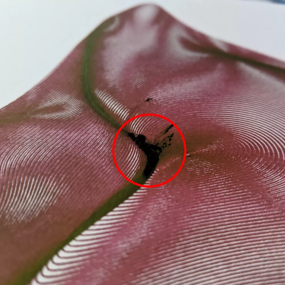
It’s not easy to know when a plot will wind up tearing your paper. In fact, looking at the rendered preview for the above plot shows a lot of closely-drawn lines, but only one spot on the page actually winds up tearing:
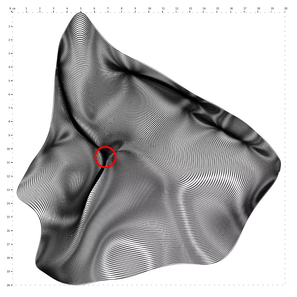
As you can see, looking at the rendered plot is not enough to know if it will tear or not. We’ll need some extra tools to point out these problematic areas.
Finding hotspots
The first step to solving this problem is simply knowing how many lines are being drawn over the same point. If we can pinpoint “hotspots” on the plot, we can guess where a plot will tear.
Since the tip of the pen has a non-zero width, it’s not as simple as calculating where the most line segments intersect – we also need to account for line segments that are close to one another as ink can bleed between strokes.
An imperfect, but totally workable solution is to divide our plot into 1x1mm squares, and then record the squares each line segment covers. See an example for a single line segment:

This approach of finding the “squares” (i.e. pixels) that a line crosses over is similar to what your computer does to render lines onto your computer screen. There’s quite a few approaches, each with tradeoffs in accuracy, speed, and simplicity. I found Bresenham’s algorithm works just fine for my purposes.
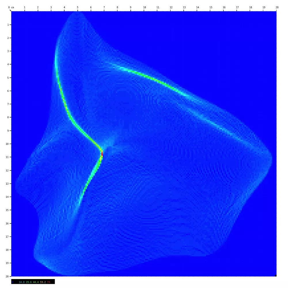
Enter the heatmap
Once we know how often each individual 1x1mm square is drawn over, we can turn that information into a heatmap. Rendering the same plot from above using this approach shows us exactly where the plot tore!
Possible next steps
Having these heatmaps has been enough to avoid surprise page tears, but there are a few ways to take this further that I haven’t explored yet:
Automatically preventing page tears
We could use this heatmap approach to automatically remove line segments in very crowded parts of the plot. I don’t know how easy this will be to do without introducing unintended artifacts, though.
Experimenting with papers, pens, inks, etc…
It could be interesting to run some experiments to find out exactly when certain kinds of paper will tear. I have a hunch that the ink “wetness” on the page plays a role, meaning factors like ambient humidity, and the time elapsed between pen strokes over a crowded area wind up factoring into this. These are quite a few variables to control, and will likely make getting accurate measurements tricky.
More “accurate” line drawing
Bresenham’s algorithm does not perform any anti-aliasing, and as a result we might be misattributing how much a given square is covered by a given line. However, I haven’t needed this added accuracy so far.
Lessons Learned
In practice, I’ve found that any more than 20 lines in a given 1x1mm square will start to damage most Bristol paper, and over 40 lines is asking for a tear. These numbers will probably vary from setup-to-setup, so I’ll share what I’ve been drawing with:
- TWSBI Eco Fountain Pens with an EF nib
- Strathmore 300 Series Bristol Vellum Paper
- Pilot Fountain Pen Ink
Happy plotting!