Spectral Ray Tracing
2024-04-13I’m sharing this to give some background on my recent artworks exploring light, color, and perception through spectral ray tracing. This ray tracer that I’ve written has shown up in a few of my series, and I wanted to explain what “spectral ray tracing” even is. I have shared some outputs at the end of this writeup.
In computer art, the artist builds both a scene and a camera to capture it out of code. The system being visualized, and process to render it into an array of RGB values are both made of the same 1s and 0s, pure abstraction turned into light. In much the same way, our eyes and brains are made of the same stuff as the universe they exist within and observe. This self-referential perspective on our awareness is both eerie and profound, obvious yet unsettling.
For this reason, this idea of building cameras out of code has stuck with me. Now there are countless ways to do so, but one very literal and well-known process is “ray tracing”. In its essence, ray tracing models the path light travels between a simulated camera and light source, bouncing rays between virtual objects in to “illuminate” the scene.
Ray Tracing
Ray tracing takes many shortcuts in the process to render an image in the name of performance. For example: ray tracing traverses the path from the light source to the camera in reverse (though there are exceptions), with the idea being that the vast majority of rays emitted from the light source never make it to the camera. By instead starting the ray at the camera’s perspective and traveling backwards, we know that the ray already “made it” to the camera. This is physically sound under our current model of the universe, as we assume the laws governing light transport are symmetric with respect to the direction of time (a.k.a. T-symmetry).

Another major shortcut that’s typically taken, but is far less physically sound, involves treating each light ray as a particle carrying the RGB vector corresponding to its “color”, ignoring any wave-like properties light has. Rather remarkably, this shortcut produces physically-realistic scenes in a wide range of scenarios. The reason why this works so well has quite a long explanation, but is in large part due to how our eyes work: simply put, we have three types of color-sensitive cells in our eyes, sensitive to short (blue), medium (green), and long (red) wavelengths of light.

However, our eyes don’t just receive red, green, and blue light (unless they’re very close to a computer screen or wearing a VR headset); our eyes are receiving a continuous spectrum of light, and converting that into the perception of color.
Seeing the Spectrum

Color that we see in the physical world is rarely made of just a single wavelength, instead, it’s a collection of many wavelengths forming what we call an SPD (spectral power distribution). For every color we can see, there are countless spectral power distributions that could correspond to that color. The fact that a single color can have many different SPDs is known as metamerism, and is a fascinating concept in its own right. For example: yellow has a corresponding wavelength as seen in the above visible spectrum at around 580nm, but it can also be reproduced with a mix of red and green light (as it must be, given that the diagram itself is being rendered using only RGB values on a computer monitor).

Another consequence of how our eyes see color from a distribution of wavelengths is the existence of non-spectral colors, like magenta. These colors can’t be reproduced by any single wavelength, and require multiple wavelengths of light to reproduce. Notice there is no magenta in that spectrum above, as it requires a mix of high and low-wavelength light (blue and red) to be seen.
What’s most remarkable about this conversion from SPD to color is that it is possible to do so purely mathematically. The fact that such a link exists, bridging physics, physiology, and our subjective experience is honestly surreal. What’s even more remarkable is that this quantitative link was made back in 1931 with the creation of the CIE 1931 color spaces, at a time before the Turing machine (let alone a computer) was even invented, and access to electricity hadn’t even made it across America.
If you want to implement this conversion yourself, I recommend reading this chapter of Physically Based Rendering, which gives a very thorough treatment of the subject.
When Wavelength Matters
As mentioned above, when ray tracing it’s often unnecessary to account for the full spectrum of light, let alone each ray’s “wavelength”. However, there are cases where a ray’s wave-like properties directly influence its path through a scene, and as a result effects the colors we see. The classic example is dispersion, when the path light takes is “bent” according to its wavelength.
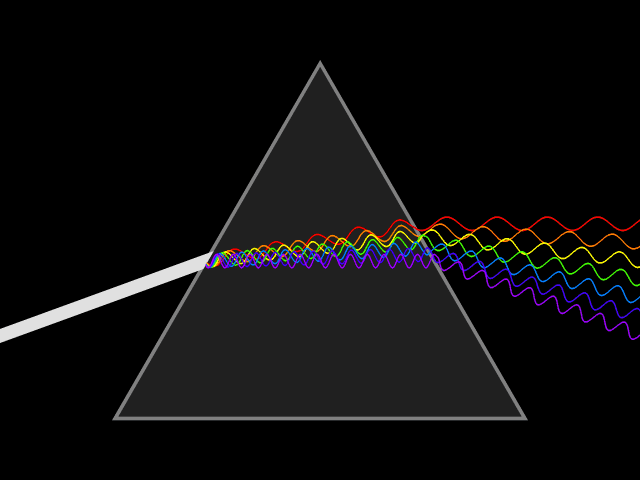
Another fascinating example you’ve probably seen in person is called “thin film interference”, and it explains the rainbow-like patterns visible on soap bubbles. These patterns are formed by the constructive and destructive interference patterns generated by the reflections off of the upper and lower layers of the soap boundary. Since this doesn’t involve splitting the spectrum into single wavelengths, but rather increasing or decreasing the contribution of parts of the spectrum the colors generated are often non-spectral colors, like turquoises, teals, magentas, browns…

Spectral Ray Tracing and Computer Art
To summarize, spectral ray tracing is just ray tracing that takes into account the wave-like properties of light. Instead of viewing the world through the lens of RGB color, spectral ray tracing generates spectral power distributions for every pixel in the scene, leveraging the wavelength and phase of rays to better estimate color in scenarios where this extra information matters.
I’ve been curious what happens when some of the laws dictating how light moves are deliberately broken, building cameras out of code in a universe just a little unlike our own. Working with the richness of the full spectrum of light, spectral ray tracing has allowed me to break the rules governing light transport in otherworldly ways.
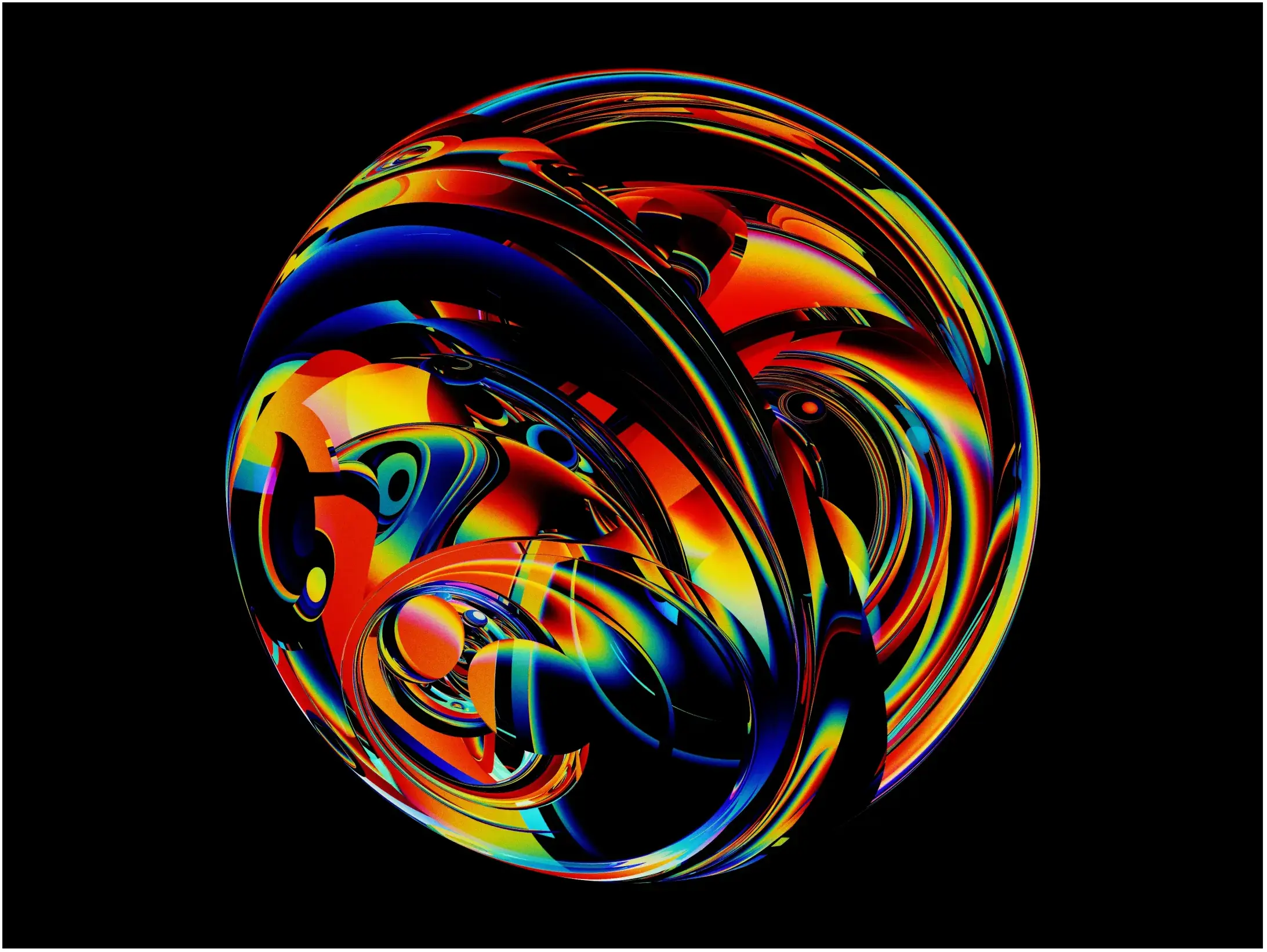
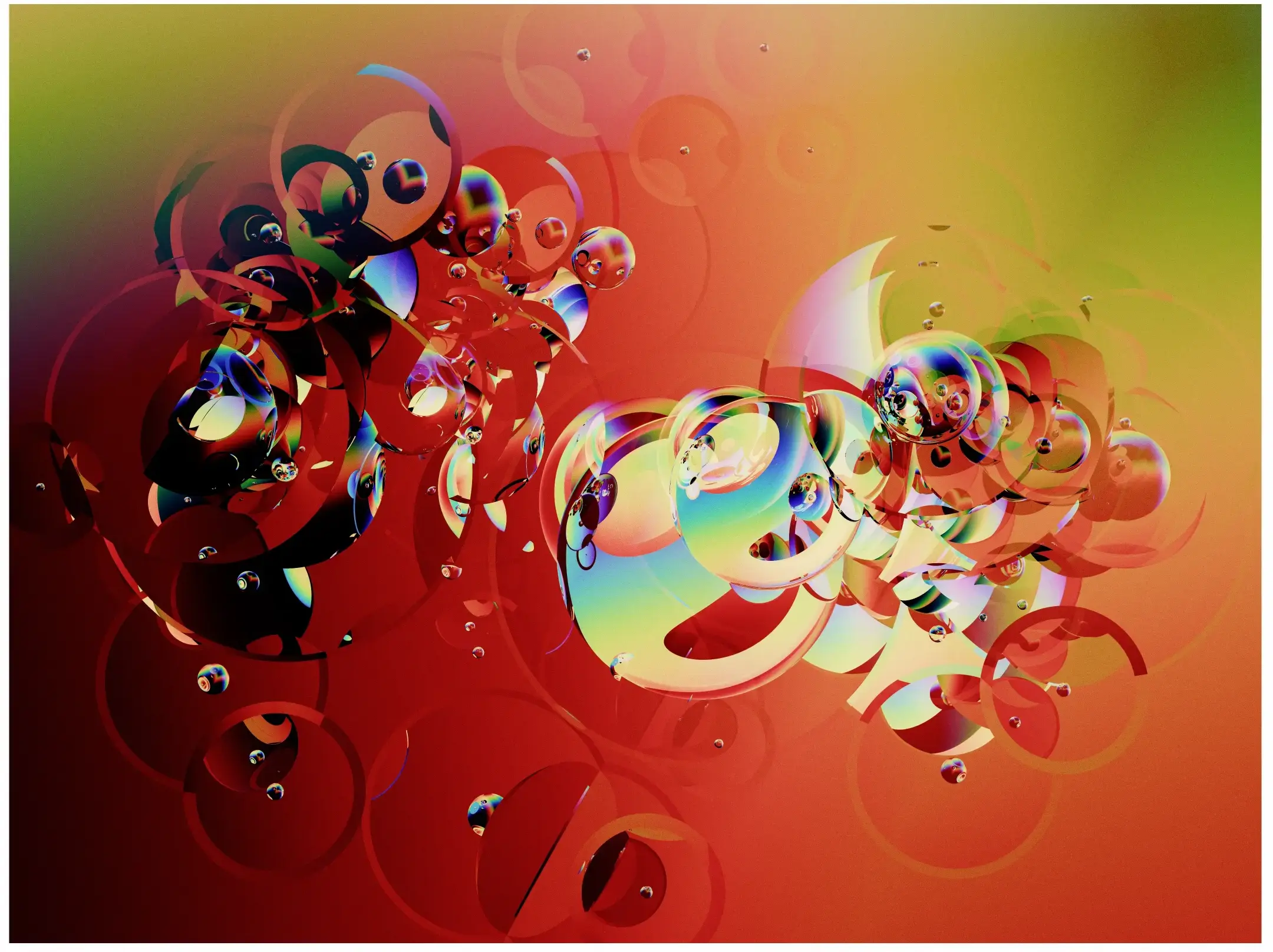
Here are a few selected outputs from the past year. All of these were generated using my hand-written, no-dependency JavaScript and GLSL spectral ray tracer.
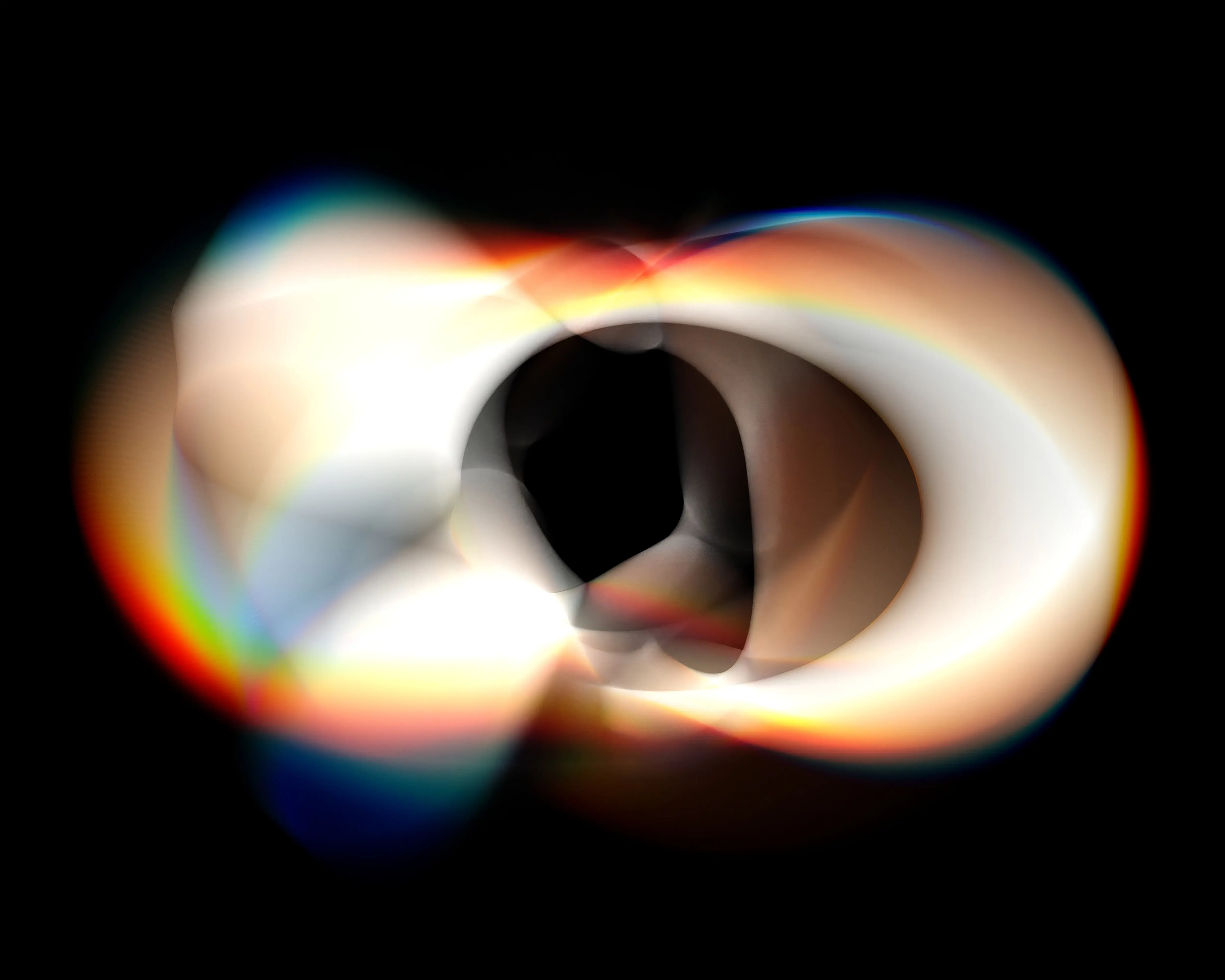
Untitled, 2023
Untitled, 2023
Untitled, 2024
I hope this has given you a little more insight into my practice and the works I’ve created. I hope to keep exploring this medium, and if this excites you, you can find more pieces like these on my twitter or instagram.